Summary:
Investing has moved from a deliberate, paperwork-heavy process to something that fits inside a five-minute app session. This shift in format, not just access, has changed how decisions get made. App design shapes investor behaviour, so it is important to understand where that is helpful and where the convenience of an app works against the deliberation good investing decisions usually need.
Introduction
Buying a mutual fund once meant a physical form, a cheque, and a wait of several days for confirmation. Today it can mean three taps and a UPI authentication. The product has not changed much. The format it is wrapped in has changed almost entirely.
That shift in format matters more than it might seem. The interface an investor uses does not just deliver information. It shapes the pace, the framing, and often the outcome of the decision itself.
From process to product
| Era | What investing looked like |
| Pre-2010s | Physical forms, broker visits, multi-day settlement, limited real-time information |
| Early digital | Desktop trading terminals, online banking-linked accounts, still relatively deliberate |
| App-first era | Instant onboarding, one-tap orders, real-time notifications, gamified interfaces |
Each stage reduced friction. The app-first era reduced it furthest, to the point where the effort required to place a trade is now often lower than the effort required to think through whether that trade makes sense.
How app design shapes decisions
Default settings carry weight
Whatever an app surfaces first, trending stocks, recent gainers, top movers, tends to get disproportionate attention, regardless of its relevance to an individual's actual portfolio
Speed removes a natural pause
A process that used to take a day now takes seconds, which also removes the built-in cooling-off period that used to sit between impulse and action
Visual design nudges behaviour
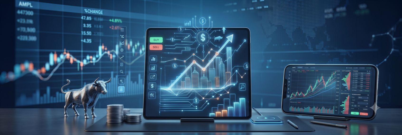
Green and red colour coding, animated price changes, and progress-style portfolio graphics create an emotional read on markets that a plain numbers table would not
Gamified elements increase engagement
Streaks, badges, and celebratory animations for completed trades borrow directly from consumer app design, and they are built to increase usage, not necessarily investment quality
None of these design choices are accidental. They reflect the same product principles used across most consumer apps, applied to a domain where more frequent engagement does not automatically mean better outcomes for the user.
Where app-based investing genuinely helps
- Lower barriers to entry: Someone in a small town no longer needs to travel to a branch or navigate paperwork to start investing
- Real-time transparency: Portfolio values, transaction history, and holdings are visible instantly rather than through periodic statements
- Easier consistency: Automating SIPs through an app removes the manual effort of remembering to invest every month
- Better access to research: Fundamental data, analyst views, and comparison tools that used to require a broker's help are now self-service
For process-heavy, repetitive tasks, the app format is a clear improvement over what came before it.
Where the app format works against good decisions
| Behaviour the app enables | Effect on decision quality |
| One-tap trading | Reduces the natural pause between impulse and action |
| Constant portfolio visibility | Increases exposure to short-term price swings that do not affect long-term goals |
| Trending and gainer lists | Directs attention toward popularity rather than fit with an individual's plan |
| Instant order execution | Removes the friction that once discouraged impulsive, panic-driven trades |
The same design choices that make investing more accessible also make it easier to act without deliberation. Convenience and good decision-making do not always move in the same direction.
The investor's role in managing this
Since app design is not going to become less frictionless, the more realistic lever is how investors choose to use these tools. A few adjustments tend to help:
- Checking portfolios at fixed intervals rather than continuously
- Treating trending lists and gainer boards as information, not instructions
- Using automation for routine actions like SIPs, while keeping larger decisions deliberate
- Setting personal rules, such as a waiting period before acting on any unplanned trade
None of this requires stepping away from digital investing. It requires recognising that the app is optimised for engagement and building personal habits that don’t simply follow that optimisation by default.
Conclusion
Markets becoming an app has genuinely widened access and simplified what used to be a cumbersome process. But the same design choices that made investing easier have also made impulsive decisions easier, and the two effects arrive in the same package.
The investors who benefit most from this shift are likely to be the ones who use the app for what it does well, speed, access, and consistency, while keeping the actual thinking behind their decisions outside the pace the app is designed to set.